【Material Design】Switches の使いかた

今回はMaterial Design の Switch の使い方を紹介します。
レスポンシブではよく見られる表示です。管理画面等で使用されることの多いコンポーネントです。
スマホではアンドロイド、iphoneともに多く使用されているので見たことのない人はいないでしょう。
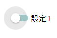
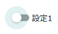
作成できるデフォルト形は以下のようなものです。
Switchesの使用方法
上記タイプを作成します。
CSS
@use "@material/switch";@include switch.core-styles;
switchの基本スタイルを読み込みます。
JS
import {MDCSwitch} from '@material/switch';const switchControl = new MDCSwitch(document.querySelector('.mdc-switch'));
switchはインスタンス化する必要があります。
HTML
<div class="mdc-switch"><div class="mdc-switch__track"></div><div class="mdc-switch__thumb-underlay"><div class="mdc-switch__thumb"></div><input type="checkbox" id="basic-switch" class="mdc-switch__native-control" role="switch" aria-checked="false"></div></div><label for="basic-switch">off/on</label>
label内の文字を変更して使用していきます。
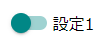
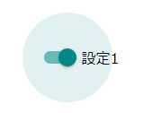
また、デフォルトの色については以下のように設定されています。
- チェック後トラック色・・・secondary
- チェック後ボタンの色・・・secondary
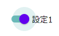
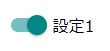
mixinの利用
mixinを利用することでon状態off状態のトラックの色やボタンの色を変更できます。
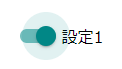
全体色変更
.my-switch {@include switch.toggled-on-color(theme.$primary); //on時の色@include switch.toggled-off-color(theme.$secondary);//off時の色}
色を指定することでその色で全体の色を変更することができます。
以下で紹介するトラック、ボタン、リップルを個別に調整する必要がありません。
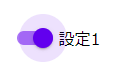
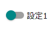
トラックの色変更
.my-switch {@include switch.toggled-on-track-color(theme.$primary); //on時のトラックの色@include switch.toggled-off-track-color(theme.$secondary); //off時のトラックの色}
on時のトラックの色、off時のトラックの色を変更できます。
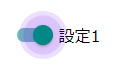
ボタンの色変更
.my-switch {@include switch.toggled-on-thumb-color(theme.$primary); //on時のボタンの色@include switch.toggled-off-thumb-color(theme.$secondary); //off時のボタンの色}
on時のボタンの色、off時のボタンの色を変更することができます。
リップルの色変更
.my-switch {@include switch.toggled-on-ripple-color(theme.$primary); //on時のリップルの色@include switch.toggled-off-ripple-color(theme.$secondary); //off時のリップルの色}
on時のリップルの色、off時のリップルの色を変更できます。
リップルサイズの変更
.my-switch {@include switch.ripple-size(100px);}
リップルのサイズを変更することができます。
密度変更
.my-switch {@include switch.density(-5);}
リップルの大きさの調整を(-5,-4,-3,-2,-1,0)の6段階で調整できます。
0がデフォルトになっています。
リップルの設定
.my-switch {$status: (hover: 0.5,focus: 1,press: 1,);@include switch.ripple-states-opacity( $status );}
リップル部分の設定ができます。
ホバー時のopacity、フォーカス時のopacity、押下時のopacityをmapで指定します。
デフォルト値は以下のようになっています。
//リップルの色が暗い色の場合$dark-ink-opacities: (hover: 0.04,focus: 0.12,press: 0.12,);//リップルの色が明るい色の場合$light-ink-opacities: (hover: 0.08,focus: 0.24,press: 0.24,);
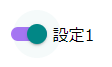
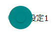
番外:iphone風にする

.mdc-switch:not(.mdc-switch--checked) .mdc-switch__track {background-color: #46d151;}.mdc-switch__track {width: 39px;height: 24px;border-radius: 16px;opacity: 1;}.mdc-switch__thumb {transform: translate(1px,5px);}
上記のようなCSSでiphoneっぽくなります。これでリップルを消しておけば完成です。
まとめ
管理画面や表示項目の「表示・非表示」を切り替える際に使用しやすいです。