【Material Design】Text Filedの使い方

今回はMaterial Design の TextField の使い方を紹介します。
フォーム内では必須のコンポ―ネントですね。また、検索用のボックスとしても非常に便利です。
今回の例として紹介するのは以下です。
- 色塗りタイプ
- 枠タイプ
- 色塗りタイプ(テキストエリア)
- 枠タイプ(テキストエリア)
- disable時
- テキストカウンター表示
- 補助テキスト表示
- 前置、後置表示
- ×ボタン表示
Text Fieldの使用方法
上記タイプの作成をしていきます。
基本的にCSS、JS部は同じです。そのためHTMLに焦点を当てて説明していきます。
CSS
@use "@material/floating-label/mdc-floating-label";@use "@material/line-ripple/mdc-line-ripple";@use "@material/notched-outline/mdc-notched-outline";@use "@material/textfield";@include textfield.core-styles;
TextFieldはCSSの読み込みが他のものよりも多いです。
テキストフィールドはスタイルの読み込みを行います。
JS
import {MDCTextField} from '@material/textfield';const textField = [].map.call(document.querySelectorAll('.mdc-text-field'), (el) => new MDCTextField(el) );
テキストフィールドのインスタンスを作成します。
複数使用することがある場合は上記のようにそれぞれインスタンス生成してください。
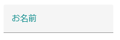
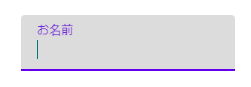
色塗りタイプ
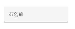
<label class="mdc-text-field mdc-text-field--filled"><span class="mdc-text-field__ripple"></span><span class="mdc-floating-label" id="my-label-id">お名前</span><input class="mdc-text-field__input" type="text" aria-labelledby="my-label-id"><span class="mdc-line-ripple"></span></label>
色塗りタイプの基本形になります。
入力欄にフォーカスされると「お名前」というラベル部分が枠内左上に移動します。
枠タイプ
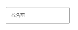
<label class="mdc-text-field mdc-text-field--outlined"><span class="mdc-notched-outline"><span class="mdc-notched-outline__leading"></span><span class="mdc-notched-outline__notch"><span class="mdc-floating-label" id="my-label-id">お名前</span></span><span class="mdc-notched-outline__trailing"></span></span><input type="text" class="mdc-text-field__input" aria-labelledby="my-label-id"></label>
こちらは外枠タイプの基本形になります。
外枠タイプではフォーカスされるとラベル部分が左上の枠線上に表示されます。
色塗りタイプ(テキストエリア)
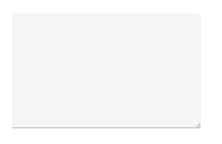
<label class="mdc-text-field mdc-text-field--filled mdc-text-field--textarea mdc-text-field--no-label"><span class="mdc-text-field__ripple"></span><span class="mdc-text-field__resizer"><textarea class="mdc-text-field__input" rows="8" cols="40" aria-label="Label"></textarea></span><span class="mdc-line-ripple"></span></label>
テキストフィールドでは基本形をもとに「mdc-text-field–textarea」を使用します。
また、ラベルを枠内に使用しないために「mdc-text-field–no-label」を使用します。
枠タイプ(テキストエリア)
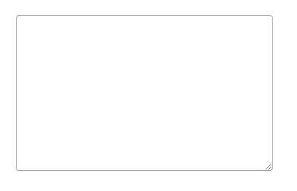
<label class="mdc-text-field mdc-text-field--outlined mdc-text-field--textarea mdc-text-field--no-label"><span class="mdc-notched-outline"><span class="mdc-notched-outline__leading"></span><span class="mdc-notched-outline__trailing"></span></span><span class="mdc-text-field__resizer"><textarea class="mdc-text-field__input" rows="8" cols="40" aria-label="Label"></textarea></span></label>
こちらもテキストフィールドの「枠タイプ」を基本に「mdc-text-field–textarea」を使用しています。
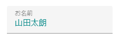
disable時
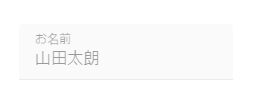
<label class="mdc-text-field mdc-text-field--filled mdc-text-field--disabled"><span class="mdc-text-field__ripple"></span><span class="mdc-floating-label" id="my-label-id">お名前</span><input class="mdc-text-field__input" type="text" aria-labelledby="my-label-id" value="山田太朗" disabled><span class="mdc-line-ripple"></span></label>
disabled時は「mdc-text-field」に「mdc-text-filed–diabled」というモディファイアクラスを付与します。
また、通常と同様にinput要素には「disabled」を指定します。
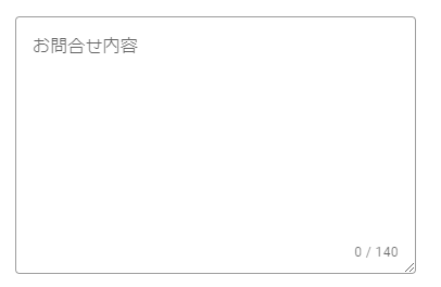
テキストカウンター表示
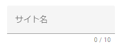
<label class="mdc-text-field mdc-text-field--filled"><span class="mdc-text-field__ripple"></span><span class="mdc-floating-label" id="my-label-id">サイト名</span><input class="mdc-text-field__input" type="text" aria-labelledby="my-label-id" maxlength="10"><span class="mdc-line-ripple"></span></label><div class="mdc-text-field-helper-line"><div class="mdc-text-field-character-counter">0 / 10</div></div>
<label class="mdc-text-field mdc-text-field--outlined mdc-text-field--textarea mdc-text-field--with-internal-counter"><span class="mdc-notched-outline"><span class="mdc-notched-outline__leading"></span><span class="mdc-notched-outline__notch"><span class="mdc-floating-label" id="my-label-id">お問合せ内容</span></span><span class="mdc-notched-outline__trailing"></span></span><span class="mdc-text-field__resizer"><textarea class="mdc-text-field__input" aria-labelledby="my-label-id" rows="8" cols="40" maxlength="140"></textarea><span class="mdc-text-field-character-counter">0 / 140</span></span></label>
テキストフィールドとテキストエリアで少し使用方法が異なります。
カウンター部分には「mdc-text-field-character-counter」を使用します。
上の例ではテキストフィールド枠下、テキストエリアは枠内に表示しています。
補助テキスト表示
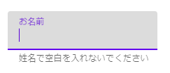
<label class="mdc-text-field mdc-text-field--filled"><span class="mdc-text-field__ripple"></span><span class="mdc-floating-label" id="my-label-id">お名前</span><input class="mdc-text-field__input" type="text"aria-labelledby="my-label-id"aria-controls="my-helper-id"aria-describedby="my-helper-id"><span class="mdc-line-ripple"></span></label><div class="mdc-text-field-helper-line"><div class="mdc-text-field-helper-text" id="my-helper-id" aria-hidden="true">姓名で空白を入れないでください</div></div>
「mdc-text-field-helper-text」を使用します。
この状態ではフォーカスされたらテキストが表示されるようになっています。
デフォルトで表示させるにはモディファイアクラス「mdc-text-field-helper-text–persistent」を使用する必要があります。
前置、後置表示
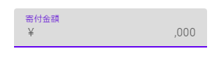
<label class="mdc-text-field mdc-text-field--filled"><span class="mdc-text-field__ripple"></span><span class="mdc-floating-label" id="my-label-id">寄付金額</span><span class="mdc-text-field__affix mdc-text-field__affix--prefix">¥</span><input class="mdc-text-field__input" type="text" aria-labelledby="my-label-id"><span class="mdc-text-field__affix mdc-text-field__affix--suffix">,000</span><span class="mdc-line-ripple"></span></label>
前置、後置の表示には「mdc-text-field__affix」を使用します。
前置ではそれに続き「mdc-text-field__affix–prefix」を使用します。
後置では「mdc-text-field__affix–sufix」を使用します。
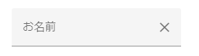
×ボタン表示
@use "@material/textfield/icon";@include icon.icon-core-styles;
import {MDCTextFieldIcon} from '@material/textfield/icon';const icon = new MDCTextFieldIcon(document.querySelector('.mdc-text-field__icon'));
<label class="mdc-text-field mdc-text-field--filled mdc-text-field--with-trailing-icon"><span class="mdc-text-field__ripple"></span><span class="mdc-floating-label" id="my-label-id">お名前</span><input class="mdc-text-field__input" type="text" aria-labelledby="my-label-id"><i class="material-icons mdc-text-field__icon mdc-text-field__icon--trailing" tabindex="0" role="button">clear</i><span class="mdc-line-ripple"></span></label>
テキストフィールド用のiconを使用するためにスタイルとjsを使用します。
htmlでは「mdc-text-field__icon」クラスを使用し、テキストの後ろに配置するために「mdc-text__icon–trailing」を使用します。
mixinの利用
色の変更やスタイル変更のためのmixinを紹介します。
下記で紹介するのはテキストフィールド、テキストエリア関係なく色塗りタイプでも枠線タイプでも使用できます。
入力文字色の変更
.my-textfield {@include textfield.ink-color(theme.$secondary);}
指定した色で入力下テキストの色を変更します。
ラベルの色変更
.my-textfield {@include textfield.label-color(theme.$secondary);}
指定した色でラベルの色を変更できます。
入力カーソルの色変更
.my-textfield {@include textfield.caret-color(theme.$secondary);}
指定した色で入力カーソルの色を変更できます。
まとめ
テキストフィールドは形式によって使用できるmixinが異なります。